Summer Figure Drawing
Medium: Charcoal on paper
Dimensions:
Completion: Summer 2015
Process
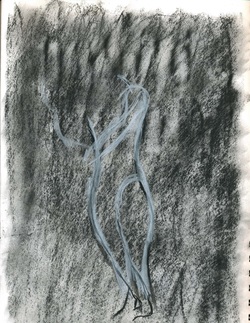
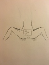
I began the figure drawing by toning the page with charcoal and experimenting with a lose form of the female figure. The page was toned with black charcoal and the form was drawn with white charcoal, my intention was to use the white charcoal to use highlights and use the dark space around the form to create the shadow that would lead to a female form. Although the tone of the page was too dark even when blended out. White charcoal was a new material for me when I began this process. When drawing human forms I realized that harsh lines take away from the form of the body. In the image to the left the dark background accompanied by the harsh white lines forming the female silhouette were too harsh. Although they resemble the torso of the female figure it did not reach the level of realism that I intended.
Moving from a female form to a male form did change proportions and the manner in which I began my drawing. Men have a wider shoulder then begin to thin out at the hips whereas women have smaller set shoulders, a smaller waist, and wider hips. With that I noticed that the shading and highlights of the body were completely different and it was not just the manner in which the model was standing.
|
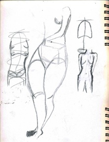
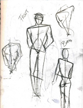
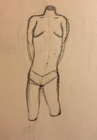
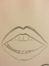
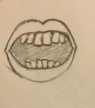
In order to get away from the harsh human outline I started to work my way from the inside of the body by drawing a lose stick structure to give myself an outline of where the shoulders, hips, knees, and feet would be place. This then mad it easier to keep proportions to the body and I could focus on small sections at a time. Once I had that loose outline I could then add bulk to the body, for example, muscle tone or shading to show the small curves on the body.
During the process I had to take note that as a model moves around the shadows and highlights along the body change. |
|
"Entry Prohibited"
Medium: Acrylic on canvas
Dimensions: 1ft x 1 ft
Completion:
Dimensions: 1ft x 1 ft
Completion:
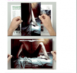
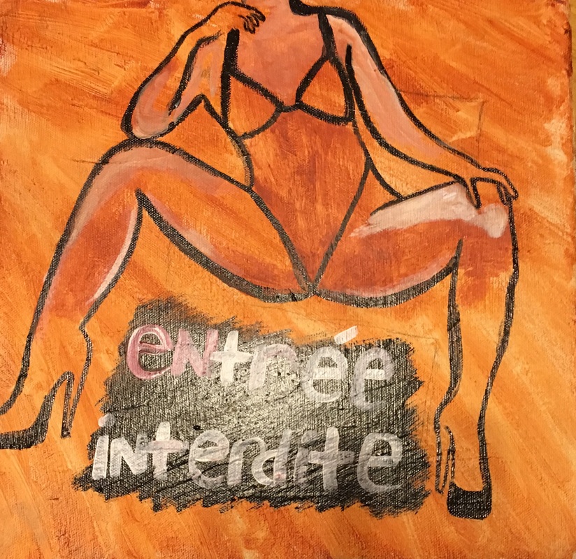
I found inspiraiton for this piece in an ad that I had stumbled across while browsing the internet. Once the pages of the magazine were torn open the message read "If you have to use force, it is rape." My intentions for this piece are to make the viewer uncomfortable, what were her intentions? Why are her legs open, were they forced? Often times women are given a reputation without any one questioning how they got to be known for that, regardless of how a woman gained her reputation through this piece I wanted to show that if a woman legs are even left wide open it is not an invitation for unwanted sexual advance. Through my piece the audience doesn't know if the legs were forced open, its a thought that lingers. The french words "Entree Interdite" which translate into "Entry Prohibited" were inspired by the french anti rape campaign. Not only that but french is often looked at as one of the languages of love. No matter how it is worded or what the excuse rape is still rape and no means no. When painting this piece I was thinking of how women in the sex industry are victims of rape every day but just because the line of work that they are in people seem to turn the other cheek to it, as if it does not exist. Sex workers are still allowed to say no and rape happens to them as well, which is why this woman was painted wearing such revealing clothing
"An Anti-rape Campaign Which Triggers Survivors (content Note for Image and Language)." Everyday Victim Blaming. 2 Apr. 2014. Web. 26 Oct. 2015.
The painting was painted using a wash on the background and simple colors because I wanted the message to be extremely clear. This work mimics Barbara Kruger by the use of the white bold lettering and Scheile with the background being a wash and the skin tone being the same color as the background. The outline of the piece is an oil based paint. The piece looks somewhat unfinished because these women are often left forgotten, nobody seems to pay attention to them or the stories that they have to tell. A theme that will be noticed throughout a lot of my pieces is that the women painted do not have a face. This is because I wanted the identity of the women to be something left to question. The viewer could place any woman on to the bodies of these figures which kind of makes it personal and easier of the viewer to relate to the pieces.
|

|
" Full Frontal"
|
Medium: Acrylic on canvas
Dimensions: 1ft x 4ft Completion: 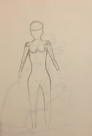
|
|
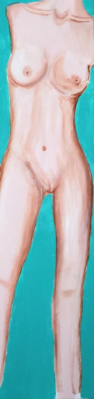
This piece was inspired by Andy Warhol by using the bright blue background to compliment the skin tone but also allowing it to stand out. Much like Warhol did with the Marilyn’s, although I used a normal flesh tone with the body. The canvas, one foot by four feet, was used to make the body big enough and make it seem as though you were standing next to an actual person. I began the piece by projecting the image onto the canvas and transferring it onto there. I started out painting by focusing on the breast area because my original intention was to place a big red X over the nipple. But once continuing the piece I thought that doing that would take away from the piece and marking the female breast as something that isn’t acceptable. This was the first time that I had ever painted a human nude so this was an entirely new learning experience for me. I had to find the contours of the body as well as find the right tone to use to bring out the curves of the body but not over power the entire figure. I knew that it would be provocative to have a full frontal nude and that would capture the attention of the viewer much more than a piece where the body is hidden. So I began to focus on the shading because I knew that it was something that I would struggle with. Originally when I started shading the breasts it looked like they were painting to the side and I had to go over the mistake with flesh tone and the breasts had to be redone entirely to fix the highlight and shading. The collarbones presented its own difficulties as well because the shading is both above and below the bone. I would start off by just having a line of white and a darker line above and below that but it did not look right. I later learned that the shading above the collarbone has to be subtle so I took the flesh tone and mixed small hues of brown in with it. This allowed a small but of shading but not too much where it over powered the entire highlight. Below the collarbone was where just brown was used to provide the shading. I struggled a lot when it came to using the paint because it would begin to thicken and become difficult to blend. Yet applying water to the area would thin the paint out just enough. Once I had the breasts and collarbones finished I went back in and filled in the entire body with the flesh tone. Taking brown and going back into the sided to bring out the curve of the hips and the torso to give it dimension. I watered down the brown as well to make it easier to outline the body. The torso is at an angle so the left side and middle of the body catch more than the right side of the body does. To show that I just went back in and added the highlight using white paint. The color scheme for this piece is extremely simply but the contrast between the body and the background allow it to stand out.
"Full Frontal 2"
|
Medium: Acrylic on canvas
Dimensions: 1ft x 4 ft Completion: 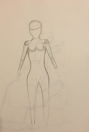
|

|
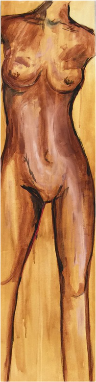
When creating this piece a wash had to be done on the background using yellow and brown. The yellow and brown mixture was diluted with water and placed on the easel at an angle so that when the wash was being placed on the canvas it would drip down my goal was also to have the brush strokes show in the background. This was done to imitate the work of Scheile; this is also why the skin tone is the same color as the background of the piece. While creating this piece the wash had to be placed on the canvas first. Once the wash had dried then the image was projected onto the canvas where I then sketched it out onto the canvas. With this piece the silhouette of the woman’s body could be outlined where I could then go back in and begin to shade and highlight the piece. The paint with this piece had to be thinned down with water, which allowed the paint to drip. The layers of paint were very thin and there was not a lot of highlight that had to be placed because the background of the piece was so light. The middle of the torso and the right thigh had the most highlights because the body is placed at an angle so that is where the light would hit the most. The color scheme of this piece was yellows browns and blacks with the small pop of red in the inner left thigh. Originally I was going to line the entire body with the red but just leaving it on the inner thigh could insinuate a woman’s menstrual cycle. It just makes the person looking at the piece wonder whether or not the female body really is a taboo object that should be left udder wraps. It is believed that the female body is more beautiful when it is kept under wraps or a secret but, in my opinion, it is equally as beautiful even when it is out there for the entire world to see. Sheile often painted news, which would often leave the viewers uncomfortable. This is something that I also tried to accomplish through this piece. I didn’t bring the shading all the way down to the rest of the legs because I wanted the focus to be on the curves and breasts since that is usually looked at the most on the female body. The piece as a whole looks messy, having the paint strokes show through the background and allowing the paint to drip giving the painting some depth. Most nudes look as if they should be painted with even skin tone and show perfect shadow and highlight. With the messy dripping background it shows that the human body, even when looked at as something gross, it is beautiful.
"Lips"
|
Medium: Acrylic on canvas
Dimensions: 1ft x 1 ft Completion: 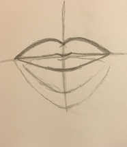
|
|
|
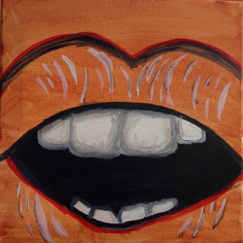
This piece compliments the female silhouette above it although they will not be displayed together. The artist of inspiration was Scheile as well and the color scheme is extremely similar. Although this piece does not follow my usual theme of feminism it does have a sexual connotation to it. Lips often go overlooked and unrecognized even tough they are very important for human interaction, obviously. Not just the obvious talking aspect of the mouth but lips change colors and become flushed when they are in difficult situations or aroused. Having the mouth wide open is up for speculation because the person could just be breathing, about to speak, or even eat. The teeth in the piece were the most difficult because the space between them had to be shown but black could not be used because then it would look like a huge gap. So I went into the piece with a light gray and began to shade in the surrounding area of the teeth. I originally was going to fill the entire lip into a red but I chose no to because a red lip would deb too provocative for what I was trying to show through this piece. The teeth are crooked as well because the majority of people to not have straight teeth, also because enow in high fashion crooked teeth are looked at as something that is beautiful when it was frowned upon for a long time. I wanted to focus on one aspect of the face rather than the entire body. So I took a small one foot by one foot canvas and did a light wash with a red and brown hue. I then did the free hand of a lip along with the teeth staring out with a high outline using the straight edge of a brush. The paint I used to crate the outline was diluted with water and then the small details were added. I then went in with thicker lines and filled in the mouth and teeth. I originally went into the teeth with a straight titanium white but that made the image very flat so I went back in with the gray. The lines on the upper and lower lip are the covers of the skin which added dimension and shows the curve of the lips without having to add shadow to it.
"Who."
Medium: Acrylic on canvas
Dimensions: 1ft x 1 ft
Completion:
Dimensions: 1ft x 1 ft
Completion:
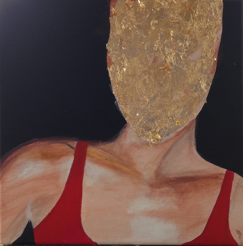
This painting has no identity because I don't want to women I paint to represent one woman. I want my pieces to represent all woman and I want the viewer to be able to place any woman they know onto the body of the woman they are looking at. I began this piece by projecting the image onto the canvas and sketching the outline onto it. I went in and filled the silhouette with a skin tone, taking that same skin tone I added brown paint to darken the paint to make a shade to begin to do the shading for the collar bones. The woman body is at an angle to the neck has more shading on the right side rather than the left side, or so I thought. So when I began to paint I noticed that the left side of the image had to be darkened because it is shorter and even though it is facing the light the way her arm comes up shortens the neck making it darker. The middle of the chest has the most highlight whereas the collar bones and the area around the shoulders had the most shading. The reason the middle of the chest had to most shank was because the light source of the woman was coming right from the front of the body. I covered the face in gold leaf by placing the adhesive first then going over it with he gold leaf. I let it dry for a moment before placing the sealant over it, I chose to put gold leave over the face because it is elegant but when used in excess some may find it trashy. I used it because a woman is looked at as always having to look elegant and in her mind she may look elegant but to others it may look trashy. The point is, it is all a matter of opinion and one woman cannot meet the expectations that many placed on women will never meet everyones expectations a fads seem to come and go. The shading along the shoulders allow for the curve of the shoulders to be shown and also a smooth transition between the dark background and the pale skin. I could expand this piece by creating a series with different variances in skin tones and possible change in clothes. I chose red because it ties the black background, the skin tone, and the gold in all together nicely.
